Free Timeline Resume Template
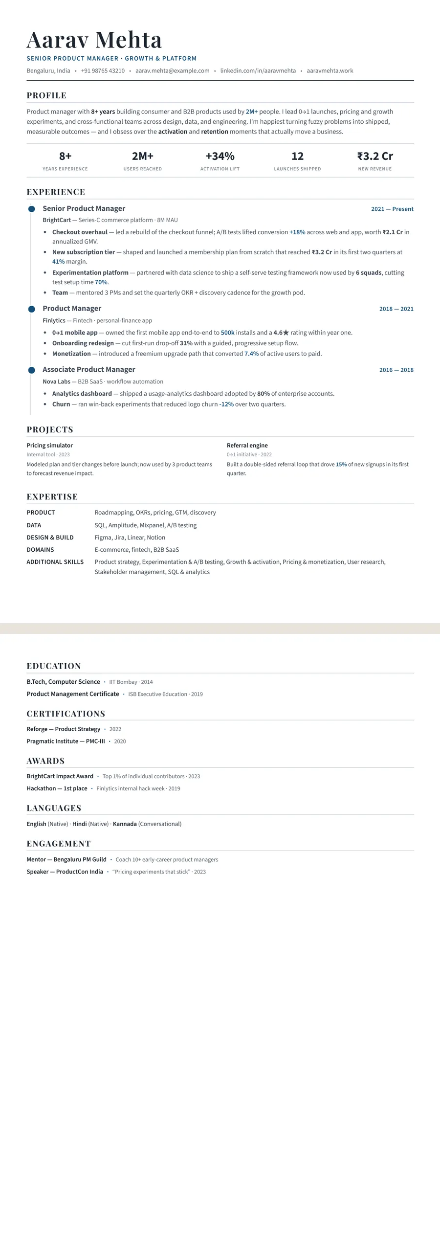
A timeline resume template sets your experience on a vertical line, with a dot for each role and the dates in a column to the left, so a reader sees how your career has moved before reading a single bullet. It suits people with a clear upward path: promotions inside one company, steady moves into bigger jobs, or a long run in one field. ResumeInk turns your current resume into this layout from a PDF, Word file or photo, and keeps every word as ordinary, selectable text.
What a timeline shows that a plain list doesn't
A timeline resume is still reverse-chronological: your latest role sits at the top. What changes is the line. Each job hangs off a single vertical rule with a dot, so the eye moves down your career as one story instead of a stack of separate boxes.
That makes three things visible at a glance:
- Promotions. Three dots under the same employer, each with a bigger title, say more than a sentence claiming you were promoted.
- Tenure. Dates in a column to the left let a reader judge how long you stayed without hunting for them.
- Direction. A move from analyst to manager to head of a function reads as a climb.
It is different from the timelines in infographic templates, where years run across the page as a drawn bar chart. Those are pictures, and the words inside them often can't be read by software. Here the line is decoration and everything else is plain text.
When a timeline helps, and when it works against you
The layout rewards a career with a shape. It suits a bank officer promoted through three grades, a nurse who moved from staff nurse to ward manager, a teacher who became head of department, an engineer who grew from developer to tech lead, or anyone who has stayed a couple of years in each role and kept moving up.
It works against you in a few situations:
- Many short gigs or contracts. Ten dots in five years make a crowded line and draw attention to churn. Group freelance work under one entry instead.
- Long gaps. The line makes them obvious. A short note on the gap helps, or a skills-led layout may serve you better; see the skills-based resume template.
- Very little history. With one internship, the line looks short. Freshers can start from the resume builder for freshers.
- A career change. If your relevant work is recent, a timeline lets older, unrelated roles take over the page.
Is a timeline resume ATS-friendly?
It can be, as long as the line is only a drawing. In ResumeInk's Timeline layout the rule and dots are styling; the job titles, employers, dates and bullets are real text in a single column, read top to bottom in the same order a person reads them. Every design is checked for this, and the ATS score in the editor shows how your own version reads.
Two habits make a timeline parse even better:
- Give each promotion its own entry. Write Senior Analyst, 2019 to 2021 and Manager, 2021 to present as two entries under the same employer. A single entry titled Analyst to Manager hides your current title from software that expects one title per role.
- Keep date formats identical. Pick one style, such as Mar 2021 to Present, and use it on every line. Mixed formats make it harder for software to work out how long you held each job.
Keep dates as typed text in the date column rather than adding them as images or icons.
Make a timeline resume with ResumeInk
Upload your resume as a PDF, Word file or photo, or start from a sample, and choose the Timeline layout. The AI rebuilds it with each role on the line and its dates beside it. Three themes suit it well:
- Indigo modern — a deep indigo line that feels current; see the Indigo timeline design.
- Midnight gold — navy with gold markers for a more senior, formal tone; see the Midnight timeline design.
- Professional — a clear blue built for everyday, ATS-friendly applications.
Click any title or date to edit it, reorder sections so projects or certifications sit where you want, and hide anything that doesn't help. If the line starts to look crowded, switch to Classic or Stacked in one tap; your words stay exactly as they are. You can also fine-tune fonts, colours and spacing, and use the optional AI help to sharpen bullets or tailor them to a job description.
Career progression designs you can use


Build your resume in minutes
Upload your current resume, edit anything, then preview and download it free.
Upload your resumeFrequently asked questions
How do I show a promotion on a timeline resume?
Give each title its own entry under the same employer, with its own dates. The line then shows each step, and hiring software reads your current title correctly.
Is a timeline resume the same as a chronological resume?
The order is the same: most recent role first. The timeline adds a vertical line and dots that connect your roles, which helps a reader see progression quickly.
Can I use a timeline resume if I have a career gap?
Yes, but the line makes gaps easy to spot. A short gap is fine; for a longer one, add a one-line entry such as a career break or full-time study, or consider a skills-first layout.
Does a timeline resume work for freelancers?
Only if you group the work. List freelancing as one entry with its overall dates and name key clients or projects as bullets, otherwise many short entries crowd the line.