Free Elegant Resume Template
An elegant resume template wins on restraint: a serif name, generous white space, one quiet accent colour and nothing that competes with your words. The result looks classy rather than loud. It suits people whose work rests on taste and composure — hotel and hospitality managers, luxury retail leads, consultants, private bankers, lawyers and senior client-facing advisors. ResumeInk builds the look from the resume you already have: upload a PDF, Word file or photo, and the AI rebuilds it in a refined design you can edit line by line.
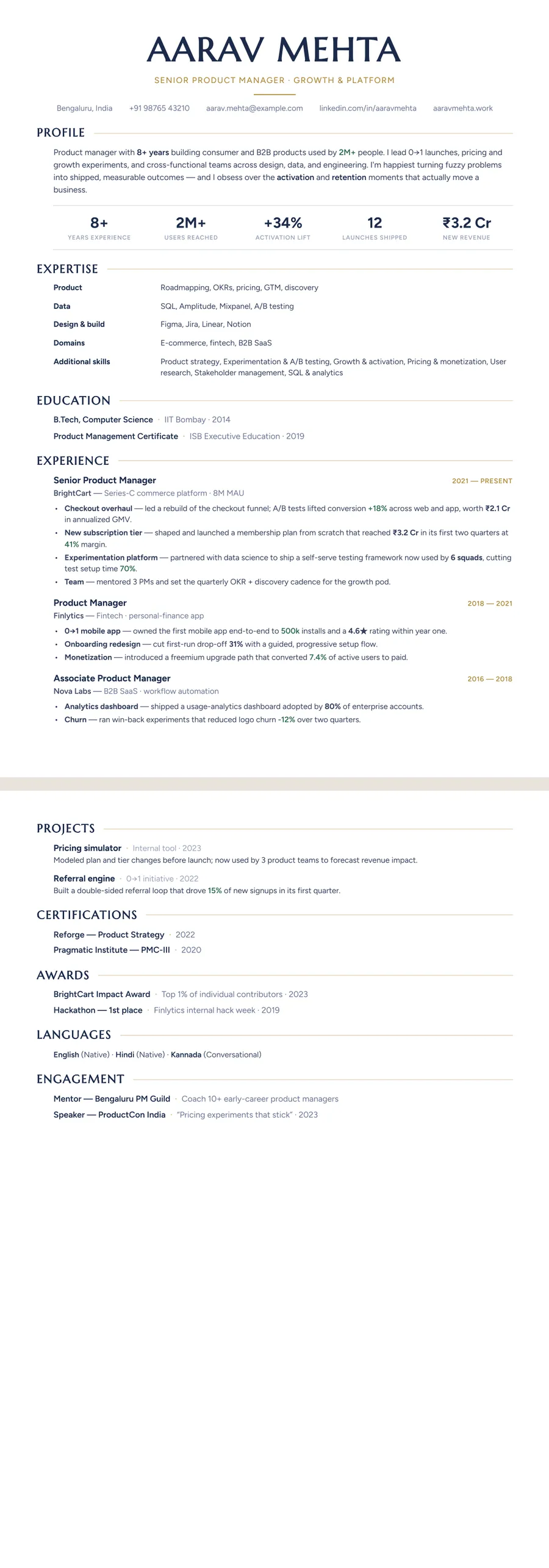
What makes a resume look elegant
Elegance on a resume comes from a few deliberate choices, not from decoration. Take away every ornament and you should still see a well-set page.
- Serif type for the name and headings. It gives the page the feel of a printed letterhead, while the body text stays plain and easy to read.
- Room to breathe. Wide margins, even gaps between sections and comfortable line lengths do more for a classy look than any graphic.
- One quiet colour. Gold on navy, deep wine, bronze or a cream page, used only for the name, headings and thin rules.
- Nothing extra. No icons, skill bars, charts or coloured boxes.
That is how it differs from a creative template, which leans on bolder colour and layout, and from a bare minimalist one, which often uses a single sans-serif font with little contrast in size. An elegant resume sits between the two: calm, but clearly designed by someone who cared.
Who an elegant resume suits, and when to choose something else
This style works best when the way you present yourself is part of the job. Think hotel general managers and front-office heads, luxury and fashion retail, wealth management, consulting, law firms, architecture practices, executive assistants to senior leaders, and anyone who sits across the table from clients. It also suits mid-career and senior people with enough substance to fill the white space. In the UK and India, where many people still say CV, a serif masthead feels natural. In the US it reads as polished without being stiff.
Choose something else in three cases. If you are applying to an early-stage startup or a hands-on engineering team, a clean sans-serif design may sit closer to the culture. If you are a fresher with one internship, generous spacing can make a thin page look emptier. And if you need to fit a lot onto one page, a denser layout such as Compact will serve you better. For leadership roles where scope matters most, see the executive resume template.
Do elegant templates pass ATS?
The serif font is not the risk. Applicant tracking systems read the characters stored in your PDF, not the shape of the letters, so a serif heading is no harder for them than a sans-serif one, as long as it is real text. The trouble with many elegant templates found online lies elsewhere: a name saved as an image, a decorative script font, headings drawn as pictures, fonts whose joined letters such as fi and ff come out garbled when copied, or pale grey body text that is hard for a person to read.
ResumeInk avoids these. Every design, including the ornamented Letterpress masthead, is checked so its text extracts as real, selectable words in a logical reading order, with no text inside images. A cream or ivory page changes only how it looks; the text underneath is the same.
Two habits help too. Use plain section names such as Experience and Education rather than clever ones. And keep every date in one format. Our guide on how to make an ATS-friendly resume covers the rest.
Make an elegant resume with ResumeInk
Start with the resume you already have: a PDF, a Word file or a photo of a printed copy, which the AI reads and rebuilds in the design you pick. You can also begin from a sample. For an elegant look, these themes do the work:
- Midnight gold — navy with gold accents, confident and formal.
- Atelier — bronze editorial tones with a premium feel.
- Ivory editorial — a cream page with refined serif headings; see the Ivory editorial design.
- Bordeaux serif — a warm wine accent with an old-world serif.
Pair them with the Atelier layout for a centred, magazine-style header, Letterpress for a large serif name under a small ornament, or Classic for a single column with dates in a narrow column to the left of each role. Ivory editorial on Atelier suits a hospitality director; Bordeaux serif on Letterpress suits a lawyer or consultant. Switch to any other design in one tap and your words stay put, then fine-tune fonts, colours and spacing until the page feels right.
Refined serif designs you can use


Build your resume in minutes
Upload your current resume, edit anything, then preview and download it free.
Upload your resumeFrequently asked questions
Is a serif font OK on a resume?
Yes. Serif fonts have long been a standard choice for CVs and resumes, and hiring software reads them as text like any other font. Keep the body at a comfortable size, and use the serif mainly for your name and headings if you want a lighter look.
What colours make a resume look classy?
One muted accent on a white or cream page: navy, charcoal, deep wine, bronze or dark green. Keep body text near-black for contrast and use the accent only for your name, headings and thin rules.
Is an elegant resume too formal for a startup or tech job?
It can feel formal for a small startup or an engineering team. Keep the same content and switch to a cleaner sans-serif design; in ResumeInk that takes one tap and nothing needs retyping.
Does a cream background affect ATS?
No. Hiring software reads the text layer, so the page colour makes no difference to it. If you expect your resume to be printed, a white page is the safer choice.