Free Bordeaux Sidebar Resume Template
The Bordeaux Sidebar resume template pairs a warm cream page with a deep wine accent and an EB Garamond serif name, giving it a refined, old-world feel without looking dated. A soft rose left sidebar holds your contact details and skills so the main column stays open for your experience. It suits people who want a classic, polished resume with a touch of colour — consultants, managers, marketers, and anyone in a relationship-driven or design-aware field.
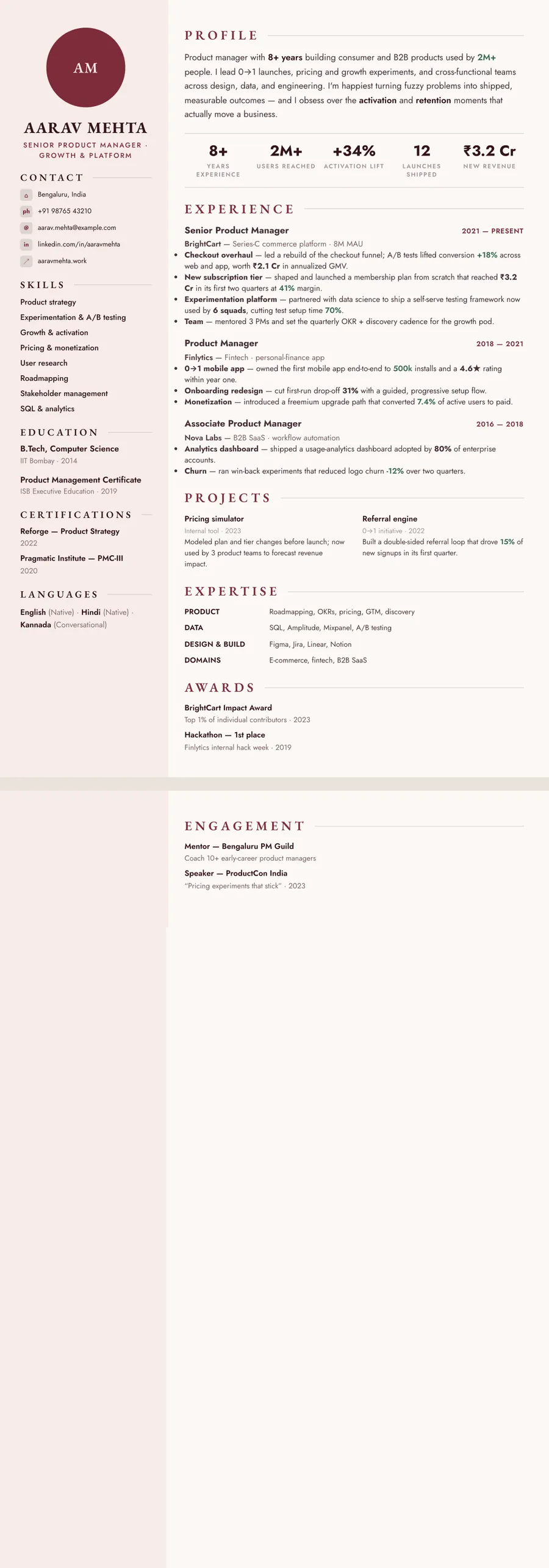
What makes the Bordeaux Sidebar design stand out
Bordeaux leads with a serif name in EB Garamond and wide-tracked, wine-coloured section headings, set against a warm cream page rather than stark white. The deep bordeaux accent (a rich oxblood) carries through the rules and your titles, while a muted green is reserved for metrics so your numbers quietly stand out. The effect is classic and considered — the kind of resume that reads as senior and self-assured rather than flashy.
The layout splits into a soft rose left sidebar for contact details and skills and a roomy main column for your experience. That separation keeps the page calm and scannable: a recruiter sees who you are and what you can do on the left, and your story top-to-bottom on the right. Generous spacing and a Jost sans for body text keep everything legible at a glance.
Who it's best for
Bordeaux fits roles where polish and personality both matter — warm enough for client-facing work, classic enough for traditional industries.
- Consultants, account managers, and client-facing professionals
- Marketing and brand specialists who want tasteful colour
- Sales and business-development professionals
- Product managers who want a senior, considered look
- Operations, HR, and people leaders in established companies
Why it's ATS-friendly
Despite the colour and serif styling, Bordeaux is built from real, selectable text and standard section headings — nothing is baked into an image. The left sidebar isn't a graphic; it's a readable column of contact details and skills that an applicant tracking system parses as plain text alongside the main experience column. With clean structure, standard fonts, and consistent date formats, your experience and skills come through to the parser exactly as written.
The Bordeaux serif typography and colours
Bordeaux serif pairs EB Garamond for headings with Jost for the body. Garamond, set in capitals for your name and widely spaced for section headings, gives the page a classic, bookish voice. Jost is a geometric sans with a slightly vintage flavour, and it holds small text such as bullets, dates and contact lines crisp. The contrast between the two is what makes the design look both traditional and current.
The colours are warm throughout. The page is a soft off-white rather than stark white, the text is a deep wine-brown, not black, while the accent is a rich bordeaux red (#7E2B3A). The accent fills the initials circle when you leave the photo out, and it colours the section headings, your target title and the dates beside each role, while the side column carries a pale rose wash.
In black and white the bordeaux prints as a dark grey and the rose side column becomes a light grey band. Headings stay strong, the side column still separates visually from the main column, and the dark text holds up well on paper.
How to fill in the Sidebar layout
Sidebar divides the page in two: a slim column down the left and a broader main column on the right. In the Bordeaux theme the side column is a pale rose band that runs the full height of the page.
- Side column, top: a circle that holds your photo or, if you leave it out, your initials, then your name, target title and contact details.
- Side column, below: skills as a short list, then education, certifications and languages. Keep each item to a line or two, since the column is narrow.
- Main column: a profile of three or four lines, an optional row of key numbers, then experience with dates on the right, followed by projects, expertise and awards.
Because the main column is narrower than a full page, bullets wrap sooner, so keep each to one or two lines and aim for three or four per role. Most people fit one page; senior candidates can run to two, and the rose band continues onto the second page. A profile opener that suits it: “Brand manager with seven years in beauty and food, launching products from brief to shelf across India and the Gulf.”
Who the Bordeaux serif design suits
Bordeaux suits people in client-facing and creative-commercial work: brand and marketing managers, account directors, hospitality and food professionals, fashion and retail buyers, event planners, and PR and communications teams. It is warm enough to show personality and classic enough for established employers such as hotel groups, luxury brands and agencies. It shows best with some years of experience behind it, because the side column gives credentials and languages a home of their own.
Sidebar is one of the four layouts that can show a photo, which makes this a natural choice for India and the Gulf, where a photo is common. For the US, UK, Canada and Australia, where photos are usually left off, skip the photo and your initials take its place in the circle.
Choose a quieter design for conservative employers in law, banking or government, or if your content is long and dense; a single-column layout gives every bullet the full width of the page.
See it in use
You can see Bordeaux serif at work in three role examples, each in a different layout:
- The marketing resume example uses Bordeaux in this same Sidebar layout, so it shows the rose side column filled in and is the one to open first if you want to judge how much that column holds.
- The brand manager resume example uses it in the Formal layout, with a centred, restrained header.
- The chef resume example is set in the Timeline layout, with roles on a vertical line of dots.
Bordeaux also appears on the burgundy resume templates page. If the photo is why you are here, the resume templates with a photo gather the designs that can show one; for a similar wine accent in a single, formal column, look at the Letterpress white design. Changing your mind is easy: another theme or layout is one tap away, and nothing needs retyping.
Premium, ATS-friendly templates


Build your resume in minutes
Upload your current resume, edit anything, then preview and download it free.
Upload your resumeFrequently asked questions
Is the Bordeaux Sidebar template ATS-friendly?
Yes. It uses real, selectable text and standard section headings, and the sidebar is a readable text column — not an image — so applicant tracking systems can parse your contact details, skills, and experience.
Can I edit or recolour this template?
You can fully edit the wording, reorder sections, and fine-tune spacing and sizing. The deep wine accent is part of the Bordeaux design, but you can switch to any other ResumeInk theme at any time for free.
How do I use the Bordeaux Sidebar design?
Upload your existing resume (PDF, Word, or a photo) and the AI rebuilds it into this design. Previewing, editing, and downloading the final PDF are all free.
What should go in the sidebar of a two-column resume?
Short, scannable details: contact information, skills, education, certifications and languages. Keep your experience and achievements in the wider main column, where they have room to breathe.
Can I use the Bordeaux sidebar design without a photo?
Yes. Without a photo, the circle that opens the side column displays your initials, which is the usual choice for applications in the US, UK, Canada or Australia.