Free Red Resume Template
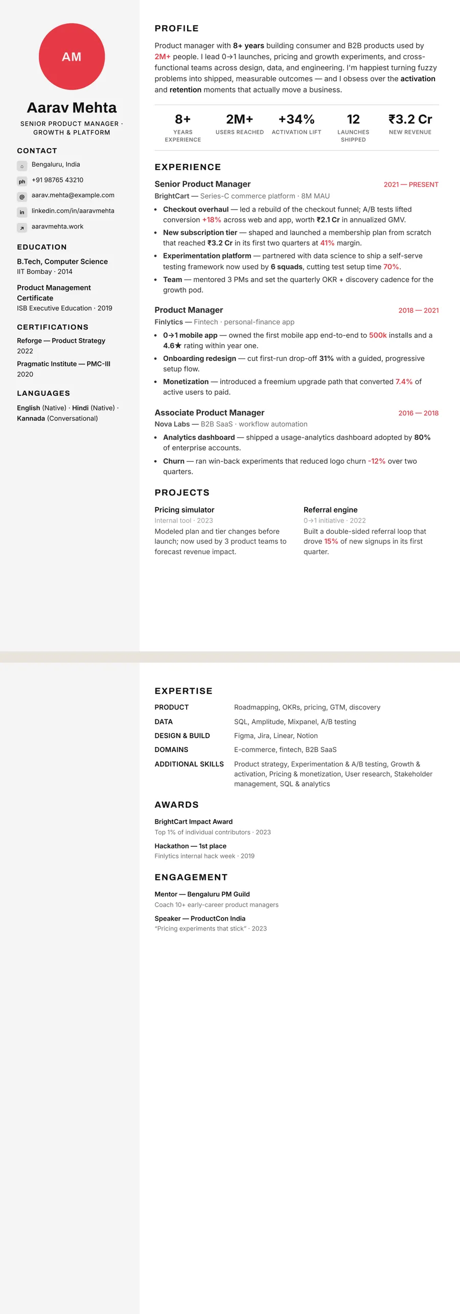
A red resume template on ResumeInk is not a red page. It is Swiss minimal: black type on white, with one bright red accent beside your name and at the section headings. That single touch gives the page energy and a clear starting point, while everything else stays as sober as a black and white resume. It suits designers, marketers, journalists, product people and startup roles, and anyone who wants to look decisive without looking loud.
What red says on a resume
Red is the loudest colour in the box. By convention it stands for energy, confidence and urgency, and it pulls the eye before anything else on the page. It also carries baggage: in an office it is the colour of warnings, overdue notices and a teacher's corrections. On a resume, that means red works best as a signal, not a theme.
Used sparingly, it suits people whose work is about winning attention or making calls:
- Creative and media — graphic designers, art directors, copywriters, journalists, video editors.
- Growth roles — marketing, brand, sales and business development.
- Startups and product — founders, product managers and early employees.
For banks, law firms, government jobs and hospital administration, a red accent can feel out of place. There, a black and white resume template or a navy design is the safer call.
Why the red stays small
A page flooded with red is hard work. Large red areas tire the eye, red paragraphs are slow to read, and solid red panels soak up toner and print unevenly. A single small accent avoids all of that and keeps the punch.
That is how Swiss minimal uses it:
- A thick red bar beside your name, so the header has one clear focal point.
- In most layouts, a short red dash in front of each main section heading, which helps the eye jump between sections.
- Everything else in black on white, including the heading words, bullets and dates.
Keep that discipline if you fine-tune the design: one red, no second bright colour, and no red body text. On a black and white office printer, the bar and dashes come out as dark grey marks and the page still holds together, because its structure never depended on colour. On screen, bright red on white has plenty of force for a mark, though it would be far too much for whole sentences.
Does a red accent affect ATS reading?
No. An applicant tracking system extracts the words in your PDF and their order; colour never enters into it. Swiss minimal's red bar and heading dashes are drawn shapes, not characters, so they neither add stray symbols nor hide anything. Your headings remain plain words such as Experience, Education and Skills.
What actually helps a red design read well:
- Black body text on a white page, which Swiss minimal uses throughout.
- A logical order in two-column layouts. In Sidebar, the light grey side column holds contact details, education and languages, and ResumeInk checks that each design extracts in a sensible sequence.
- Keywords from the job advert, written in plain language rather than squeezed into graphics.
Before you export, the ATS score in the editor tells you how readable the page is for hiring software. For picking those words, see our guide to resume keywords for ATS screening.
Swiss minimal: ResumeInk's red design
ResumeInk's red option is a single theme, Swiss minimal: a white page, black text and one bright red accent, with a left-aligned header and a light grey side column in two-column layouts. There is no red-background theme, and that is deliberate. Swiss minimal works with all 13 layouts, including the four shown here:
- Sidebar — a photo or initials circle, contact details and education in the side column, with experience and projects in the main one.
- Compact header — the densest layout, with skills as small chips under the header, for a one-page resume.
- Timeline — roles on a vertical line with dots, dates on the same line as each job title.
- Classic — a single column with dates to the left of each role.
See the Swiss minimal template. For deeper reds, Bordeaux serif and Gallery white appear on the burgundy resume template page. Switch between any of them in one tap; your text stays.
Red designs you can use


Build your resume in minutes
Upload your current resume, edit anything, then preview and download it free.
Upload your resumeFrequently asked questions
Is a red resume too bold for a job application?
A red page usually is, but a red accent rarely is. One small touch of red on a black and white page looks confident and organised, which is how Swiss minimal uses it.
Which jobs suit a resume with red accents?
Red accents suit design, advertising, marketing, media, sales and startup roles, where a confident look fits the work. For banking, law, government or healthcare administration, a black and white or navy design is usually the safer choice.
Do red accents affect how an ATS reads my resume?
No. Applicant tracking systems read the text and its order, not its colour, and Swiss minimal's red bar and heading dashes are shapes rather than text.
Is there a ResumeInk template with a full red background?
No. Swiss minimal keeps red to a single accent on a white page, because large areas of red are hard to read and print poorly. For deeper reds, Bordeaux serif and Gallery white use wine and crimson accents.