Free Green Resume Template
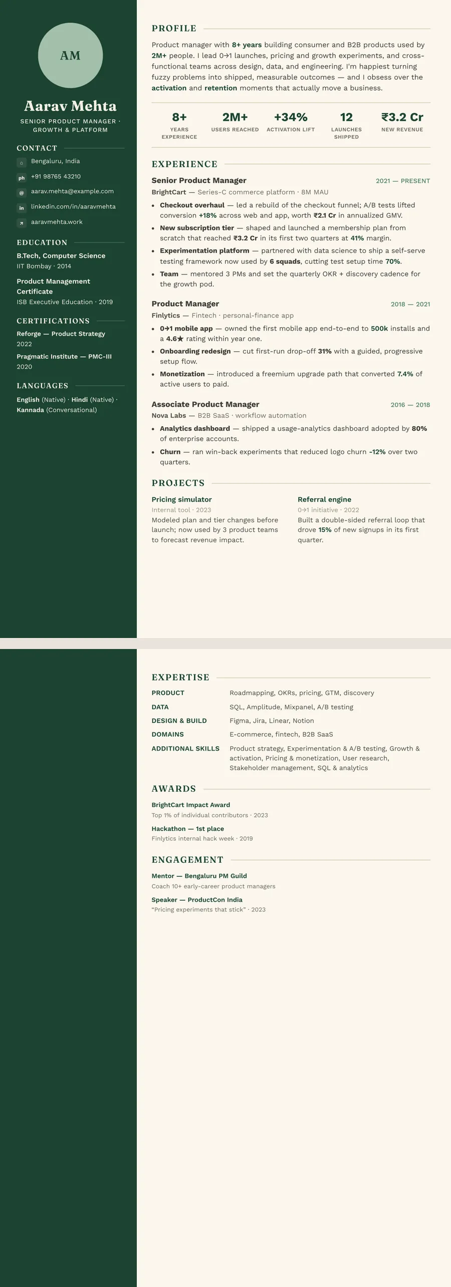
A green resume template puts green in the headings, the rules between sections or a side column, while the body text stays dark and easy to read. ResumeInk has two green themes. Forest editorial pairs deep forest-green ink with warm off-white paper, and Sage botanical uses muted sage on a very light green-grey page. Green suits people in sustainability, health, education, food and finance who want a page that feels calm and settled rather than loud. Every design is checked for ATS text extraction.
Where green fits on a resume, and what it signals
Colour on a resume works by convention, not by science. In most English-speaking job markets, green reads as steady, outdoorsy and growth-minded. It is the colour of banknotes in the US, of parks and fields in the UK, and of fresh starts in many cultures. No recruiter applies that as a rule, but it shapes the first impression a page gives.
Green tends to sit comfortably in these fields:
- Sustainability, energy and agriculture, where it echoes the work itself
- Healthcare, wellbeing and education, where a calm page suits the role
- Food, hospitality and retail, where a little warmth helps
- Finance and accounting, in the deep forest shade that reads as serious
A dark forest green is quiet enough for most offices, including many corporate and public-sector roles. For a law firm or a government CV, keep the green to thin headings, or go fully neutral with a black and white resume template. In design, marketing and startup roles, a deep green sidebar is welcome.
Using green well: accent, contrast and print
Treat green as an accent, not a background. The safest places for it are section headings, thin rules, your name and, in a two-column layout, the side column. Keep the body text dark. In ResumeInk's green themes the main text is deep green or near-black on a light page, so long bullet points stay comfortable to read on a laptop and on paper.
Pick one shade and stay with it. A forest heading next to a lime icon and a teal link looks accidental. One colour family, used in two or three places, looks planned.
Think about how the page prints. Plenty of CVs are still printed in black and white for an interview panel. Deep forest green turns into a dark grey that holds up well. Sage is lighter, so sage headings print as a mid grey; they stay readable because headings are short and set larger than the body, and the text beneath them stays dark. If you know your CV will be photocopied, Forest editorial is the safer of the two.
Can an ATS read a green resume?
Yes, as long as the text underneath the colour is real. An applicant tracking system reads the characters in a PDF; it does not judge the shade of your headings. What can trip a parser is text drawn inside an image, or a layout whose reading order jumps around. ResumeInk avoids both. Every word is selectable text, the sections follow a logical order, and all 260 designs are checked in ATS text extraction.
Contrast matters more to people than to software. In the Forest editorial Sidebar design, your contact details and education sit in light text on a deep green column. That reads clearly on a good screen, but small light text on a coloured block is harder going for some readers and on weak printers. Keep the side column to short facts, and put anything long in the main column on the light page. Sage botanical avoids the issue: its side column is pale, with dark text.
Before you send it, check the ATS score in the editor. If you want the background, read what an ATS is and how it reads a resume.
ResumeInk's green designs: Forest and Sage
Two themes make up the green set. Each works with all 13 layouts, and four of the pairings are shown on this page.
- Forest editorial — deep forest-green ink (#1B4332) and green accents on warm off-white paper. With the Sidebar layout the left column becomes a full-height deep green panel; with Timeline your roles run down a vertical line with dots, dates beside each job title.
- Sage botanical — muted sage-green headings on a very light green-grey page. Portrait gives it a soft sage side column for your photo, skills and languages. The Sage botanical Skills-first design opens with a shaded block of grouped skills, which helps a career changer lead with what transfers.
Want only a hint of green? Slate tech puts teal accents on a dark slate sidebar; you will find it among the grey and slate designs.
Upload your resume as a PDF, Word file or photo and the AI rebuilds it in the design you choose. Swap Forest for Sage, or Sidebar for Timeline, in one tap. Nothing needs retyping.
Green designs you can use


Build your resume in minutes
Upload your current resume, edit anything, then preview and download it free.
Upload your resumeFrequently asked questions
Is a green resume professional?
Yes, when the green is an accent and the text stays dark. A deep forest green reads as calm and serious in most offices, while a bright lime would not. For a very conservative employer, keep the green to the headings only.
Are colored resumes ATS-friendly?
Colour itself does not stop an applicant tracking system, because the system reads the text, not the shade. What matters is real text in a logical reading order, which every ResumeInk design is checked for.
Should I choose Forest or Sage for my CV?
Forest editorial is deeper and more formal, and it survives black and white printing better. Sage botanical is softer and lighter, which suits healthcare, education, wellbeing and creative roles. Try both in the editor; changing theme keeps your text.
Is green a good colour for a finance or accounting resume?
A deep forest green can work well in finance and accounting, where it feels steady without looking flashy. Keep it to headings and rules, set it in the Formal or Classic layout, and skip the dark sidebar if the firm is very traditional.