Free Gray Resume Template
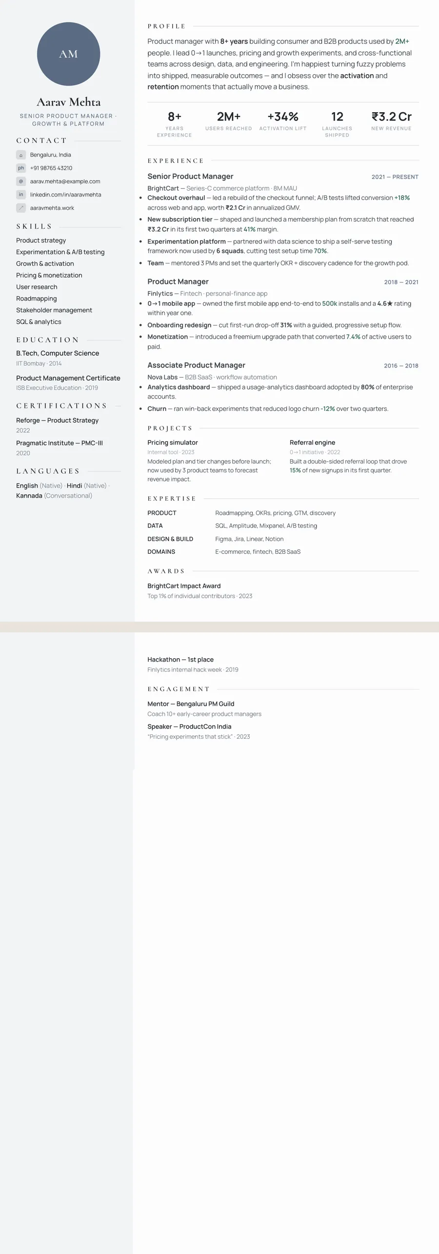
A gray resume template (grey, in British spelling) sits between plain black and white and a bolder colour. Grey reads as calm, modern and objective, so it suits finance, consulting, engineering, IT and operations, and senior candidates who want polish without fuss. ResumeInk has two grey themes. Platinum slate is light and understated, with cool grey-blue accents. Slate tech is bolder, pairing a dark slate sidebar with teal accents. In both, body text stays dark and easy to read.
Where a grey resume fits best
Grey sits between black and white, and that is how it tends to read: balanced, objective and modern, without drawing attention to itself. By convention it signals method rather than flair, and it is common in the branding of technology and financial firms.
- Finance and consulting — analysts, auditors, actuaries, strategy consultants.
- Engineering and IT — civil and mechanical engineers, IT managers, cloud and data roles.
- Operations and law — project managers, supply chain leads, compliance and legal operations.
Grey is also one of the safest colours for conservative employers. A UK or Indian CV for a bank, a government department or a large law firm can use Platinum slate without anyone noticing the colour first. Where grey falls short is warmth: for teaching, care or hospitality it can feel cold, and a beige resume template may suit you better.
Using grey without making the page pale
The risk with grey is fading. A soft grey for body text can look elegant on a large monitor, then turn faint on a phone or a tired office printer. Avoid that by keeping grey for structure:
- Dark text, always. Paragraphs and bullets should be near-black. Both ResumeInk grey themes work this way.
- Grey for frames. Use it for headings, thin rules, labels and the background of a side column.
- One partner colour at most. Grey plus a single accent, like Slate tech's teal, is plenty.
Grey is the colour least changed by black and white printing, since it is already neutral, so Platinum slate looks much the same on paper as on screen. Slate tech's dark sidebar becomes a solid dark band when printed, which looks bold and uses more toner. If you expect your resume to be printed and photocopied for an interview panel, the lighter theme is the practical pick.
Grey resumes and ATS reading
Colour is not something an applicant tracking system looks at. It reads the text layer of the PDF: the words, in order. A grey heading, a slate panel or a teal rule changes nothing for the software as long as the text behind it is real.
The things worth checking are the same in every design:
- Selectable text. No heading or contact line should be part of an image. All 260 ResumeInk designs are checked for this.
- Sensible order. In a two-column design, the sidebar and the main column must extract in a logical sequence.
- Human contrast. Slate tech's sidebar uses light text on dark slate. Software reads it without trouble, but small light-on-dark type is harder for some people, which is why the Sidebar layout keeps that column to short items such as contact details, education and languages.
To see how ResumeInk approaches structure and scoring, visit the ATS resume builder.
ResumeInk's grey and slate designs
Two ResumeInk themes cover grey, one light and one dark:
- Platinum slate — cool grey-blue accents on a near-white page, with a light grey side column in the two-column layouts. It feels understated and premium. In Sidebar, that grey column holds your photo or initials, contact details and education; in Formal, a centred, restrained header suits senior, legal and finance roles. See the Platinum executive template.
- Slate tech — a dark slate sidebar with teal accents on a white page. In single-column layouts there is no sidebar, so you get dark slate type and teal accents: Stacked puts an expertise grid and education above experience, and Timeline sets roles on a vertical line with dots. See the Slate professional template.
Upload a PDF, Word file or photo of your current resume, or begin with the sample. Moving between Platinum and Slate, or between layouts, takes one tap and keeps every word you have written.
Gray designs you can use


Build your resume in minutes
Upload your current resume, edit anything, then preview and download it free.
Upload your resumeFrequently asked questions
Is it a gray resume or a grey resume?
Both are correct. Gray is the usual American spelling, while grey is standard in the UK, India, Australia and most other English-speaking countries, and the colour is the same either way.
Is a grey resume a good choice for banking and finance jobs?
Yes, it is one of the safest colour choices for conservative employers. Platinum slate, with its light grey-blue accents and dark text, looks measured and senior without feeling flat.
Can I use light grey text on my resume?
Avoid it for anything that matters. Pale grey looks refined on a large monitor but fades on phones, worn office printers and photocopies, so keep paragraphs, dates and contact details dark and use grey for rules and backgrounds.
Does a dark sidebar cause problems with ATS software?
Not on its own. The software reads the text, not the background colour, so light text on a dark slate panel is still extracted. What matters is that the sidebar holds real text in a sensible order, which every ResumeInk design is checked for.