Free Platinum Executive Resume Template
Platinum is an understated executive resume template built around a calm slate-grey palette and a quiet sidebar layout.
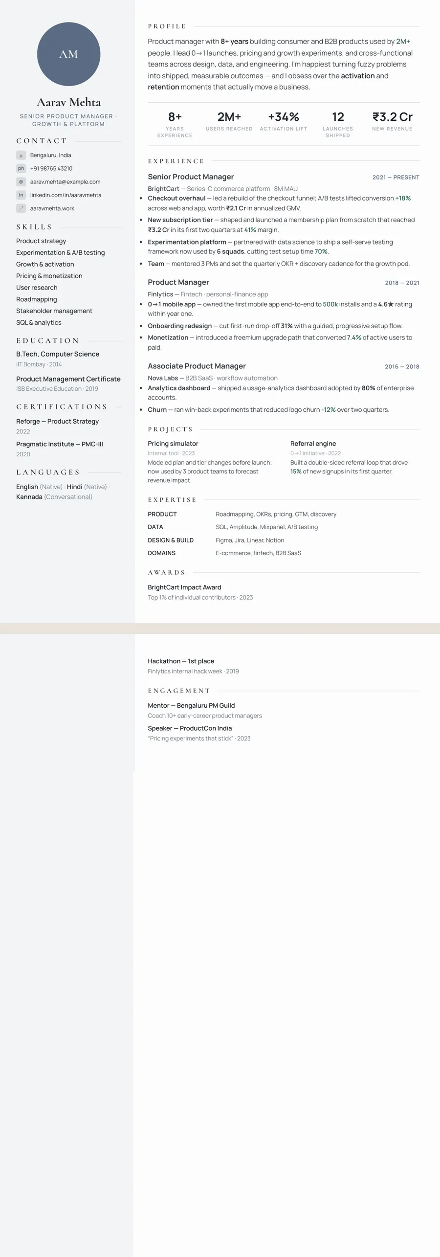
What makes the Platinum Sidebar design stand out
Platinum trades flashy accent colours for a composed, premium grey scheme — a soft near-white page, a pale slate sidebar, and a muted blue-grey accent used sparingly. The pairing of an elegant Cormorant serif name and section headings with clean Manrope body text gives it a tailored, boardroom feel, while the wide letter-spaced section labels add a sense of quiet authority rather than decoration.
The sidebar holds your contact details, skills, and supporting facts so the main column can stay devoted to your strongest experience. The overall impression is deliberate and senior: a resume that looks considered and expensive without ever shouting, which is exactly the signal an executive-level reader is looking for.
Who it's best for
Platinum suits people whose seniority and judgement are the headline. The understated grey tone reads as established and trustworthy, making it a natural fit for leadership and client-facing roles:
- Executives, directors, VPs, and other senior leaders
- Experienced product managers presenting strategy and outcomes
- Senior marketing and brand leaders who value a polished, on-brand look
- Heads of sales and revenue leaders pitching to executive readers
- Consultants, finance, and operations professionals who want a refined, conservative finish
Why it's ATS-friendly
Platinum looks premium, but underneath it's plain, real text in a clean, ordered structure — never an image or a graphic of your resume. The sidebar isn't a complex table; it renders as a single readable column of text that flows in a logical order, so an applicant tracking system can detect your headings, parse your experience and skills, and read every word. You get an understated executive design that still sails through the keyword scan.
The Platinum slate typography and colours
Platinum slate sets your name and section headings in Cormorant, a refined display serif in the Garamond tradition, with fine strokes and elegant curves. Body text is Manrope, a modern sans with even, open shapes, so the serif provides the polish while the sans handles the detail. Section labels are set in spaced capitals and finished with hairline rules, which gives each part of the page a measured, unhurried look.
Colour is kept almost entirely to greys. The page is a near-white, the side column a pale silver grey, the text a soft charcoal, and the accent a muted blue-grey (#5A6B82) used for small details such as your subtitle and the circle behind your initials. Nothing is bright, which is the point: the design signals seniority by holding back.
Because it is already close to greyscale, Platinum prints in black and white with almost no change. The light side column uses very little toner and the charcoal text stays sharp, so it is a sensible choice if you plan to bring printed copies to an interview.
How to fill in the Sidebar layout
In the Sidebar layout, a narrow column on the left holds your identity and credentials, and a wider column on the right holds your track record. In Platinum that left column is pale, so it reads as part of the page rather than a heavy panel.
- Top of the side column — a circle with your photo, or your initials if you skip the photo, then your name, your title and your contact details.
- Rest of the side column — education, certifications and languages. Senior candidates can list just the degree and institution and drop grades.
- Main column — open with a profile of three or four sentences, around 60 to 80 words, framed around scope: budgets, teams, markets.
- Key numbers and experience — a short band of headline figures, then roles with title and dates on one line and four to six results-led bullets each.
- Expertise — labelled rows after experience, such as "Leadership: budget ownership, board reporting, vendor strategy".
Example bullet: "Led a 45-person finance team through an ERP migration, closing the monthly books in 5 days instead of 9." Two pages are normal at this level, and the pale column repeats on page two so both pages match.
Who the Platinum slate design suits
Platinum slate is for people whose experience should speak quietly and with authority: finance leaders, engineering managers, senior analysts, consultants and directors in established companies. It suits mid-to-late career candidates best, especially in banking, insurance, energy, manufacturing and professional services, where an understated look is expected. Senior engineers use it well too when they want to read as leaders rather than specialists.
The photo circle that heads the side column is optional. Candidates in the US, UK, Canada and Australia usually leave it empty, and the circle shows your initials instead. In India and the Gulf, a formal headshot is common, and the pale column frames it well.
Choose something with more energy if you are early in your career or applying to creative agencies, start-ups or consumer brands, where Platinum's restraint can read as cautious. A design with a stronger accent colour will do more work for you there.
See it in use
Platinum slate appears in four role examples on the site, and all four use a layout other than Sidebar, so each one shows the greys in a new arrangement:
- the financial analyst resume example, set in the Stacked layout
- the electrical engineer resume example, in Classic centered
- the software engineer resume example, in Developer stack
- the machine learning engineer resume example, in Skills-first
You can also find it on the gray resume templates page, next to other quiet neutral designs. For the same Sidebar structure with a darker, more technical feel, compare the Slate professional design; for other designs aimed at senior roles, see the executive resume templates.
Changing your mind takes a single tap. Pick a new theme or layout in the editor, compare it with this one, and your content stays exactly as written, down to the last bullet.
Premium, ATS-friendly templates


Build your resume in minutes
Upload your current resume, edit anything, then preview and download it free.
Upload your resumeFrequently asked questions
Is the Platinum template ATS-friendly?
Yes. It uses real, selectable text in a clean, well-ordered structure, and the sidebar parses as a single readable column, so applicant tracking systems can read every section.
Can I edit or recolour this template?
Yes — all text is fully editable, and you can fine-tune sizing, spacing, and the design before downloading, then switch to another theme or layout any time at no extra cost.
How do I use the Platinum design?
Upload your existing resume (PDF, Word, or a photo) and ResumeInk's AI rebuilds it into the Platinum Sidebar design. Previewing, editing, and downloading are all free.
Is the Platinum sidebar dark or light?
Light. The side column is a pale silver grey with dark text, so it prints cleanly and looks softer than a dark sidebar. If you prefer a dark column, the Slate tech theme uses the same layout with a deep blue-grey sidebar.
Should an executive resume be one page or two?
Two pages are normal for senior candidates with a long record of results. Make the first page strong on its own, with your profile, key numbers and most recent role, since some readers stop there.