Free Brown Resume Template
A brown resume template swaps the usual blue or black for earthy accents: terracotta, bronze or taupe on a warm, light page. It feels grounded and approachable, and a little different from the rest of the pile without being loud. ResumeInk has three themes in this range: Dune terracotta, Atelier and Ivory editorial. They suit food and hospitality, sustainability, architecture, craft, retail, teaching and nonprofit work, and anyone whose strengths include patience, reliability and a practical eye.
What brown says on a resume, and where it fits
Brown is the colour of soil, timber, leather and coffee. By long convention it reads as grounded, dependable and unpretentious, and warmer shades such as terracotta add a little energy. On a resume it says you are steady and practical, with some personality.
That suits a wide range of work:
- Food and hospitality — chefs, cafe and restaurant managers, hotel operations.
- Land and making — agriculture, sustainability, landscape architecture, carpentry and furniture design.
- Care and community — teaching, counselling, social work and nonprofit programmes.
Brown also helps people moving into these fields from elsewhere, because the look matches the work they are heading towards. For banks, law firms and government posts, tone it down. Ivory editorial's taupe is quiet enough for most formal settings, while Dune's terracotta is the boldest of the three and better kept for creative, food and hospitality applications.
Terracotta, bronze or taupe: using brown well
Brown is really three shades here, and each sets a different mood:
- Terracotta leans towards orange and red. It is warm and noticeable, so it belongs on headings and rules rather than long text.
- Bronze has a golden cast that feels polished and slightly formal.
- Taupe mixes brown with grey. It is the most restrained and the easiest to wear in an office setting.
Whichever you choose, the brown should frame the content while the content itself stays dark. In these themes, body text is near-black or a deep brown on a light page, which keeps paragraphs comfortable on a laptop or a phone. Stick to one brown and resist adding a second bright colour. Printed in black and white, brown accents turn into mid-greys, and headings stay clear because they also differ from the text around them in size and weight. For a paler take on the same warmth, see the beige resume template.
Brown accents and ATS software
An applicant tracking system pulls the words out of your PDF and ignores their colour. A section heading set in terracotta is still the word Experience to the software, exactly as it would be in black. So the colour choice is about people; the ATS cares about structure.
Three things decide how well a brown resume reads, to software and to a recruiter:
- Text must be real and selectable, never part of a picture. Every ResumeInk design is checked for this.
- Sections should follow a logical reading order, including in two-column layouts such as Sidebar.
- Contrast should stay high. All three brown themes use a light side column with dark text, so nobody has to strain over pale type on a dark panel.
Beyond that, use standard section names and the words from the job advert you are answering. Our guide to making an ATS-friendly resume covers the details.
ResumeInk's brown designs
Three ResumeInk themes carry brown tones, and any of them can be paired with any of the 13 layouts:
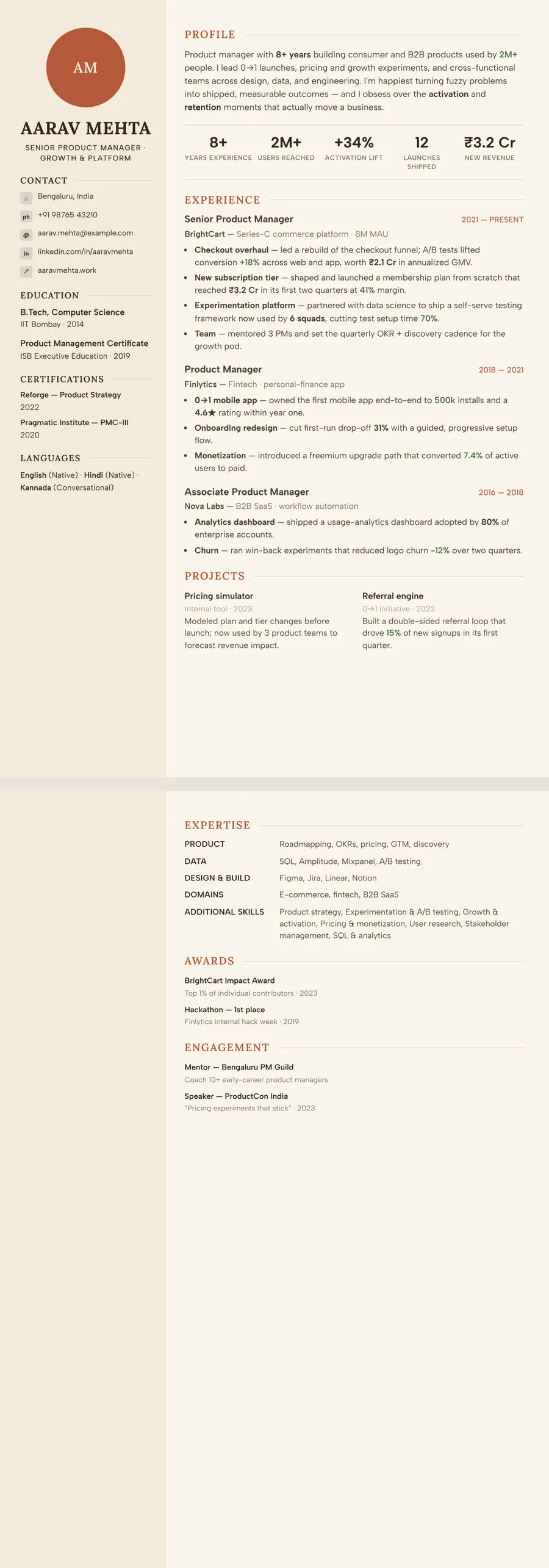
- Dune terracotta — rust-coloured section headings and accents on a warm sand-cream page. The Sidebar layout gives you a side column for your photo or initials, contact details and education; Timeline sets each role on a vertical line with dots, dates beside each job title. See the Dune modern template.
- Atelier — bronze accents on a warm off-white page with a cream side column. Paired with the Atelier layout it has a centred editorial header and generous, refined spacing.
- Ivory editorial — taupe-brown accents and a cream side column, the most understated of the three. In the Classic layout the dates sit in a narrow column left of each role.
Start by uploading your resume as a PDF, a Word file or a photo, and the AI rebuilds it in the design you pick. Try Dune, then Atelier, then Ivory: one tap each, and you never retype a word.
Brown designs you can use


Build your resume in minutes
Upload your current resume, edit anything, then preview and download it free.
Upload your resumeFrequently asked questions
Is brown a good colour for a resume?
It can be, especially in warm, people-facing or hands-on fields. Brown works best as an accent for headings, rules and a side column, with the main text kept dark on a light page.
Which jobs suit a terracotta or rust resume?
Terracotta has warmth and some energy, so it fits hospitality, food, events, interior and landscape design, sustainability work and creative roles. For a more reserved look in the same family, Atelier's bronze or Ivory editorial's taupe are quieter.
How do brown headings look when printed in black and white?
They print as mid to dark greys. Because headings also differ from body text in size, weight and spacing, the structure of the page stays easy to follow.
Can I send a brown resume to a bank or law firm?
You can, if you choose the quietest shade. Ivory editorial's taupe accents are restrained enough for most formal settings, while Dune's terracotta is better saved for creative and hospitality roles. If in doubt, switch to the Black and white theme in one tap.