Free Blue and Navy Resume Template
A blue resume template is the least risky way to add colour to a CV. Blue headings, rules or a navy side column make the page look considered, and your actual words remain in near-black. ResumeInk has four blue themes: Professional in corporate blue, Indigo modern in blue-violet, Terminal developer in bright blue with a monospace look, and Midnight gold, a navy blue resume template with muted gold details. Blue fits almost any office, from banks and consultancies to hospitals, schools and software teams.
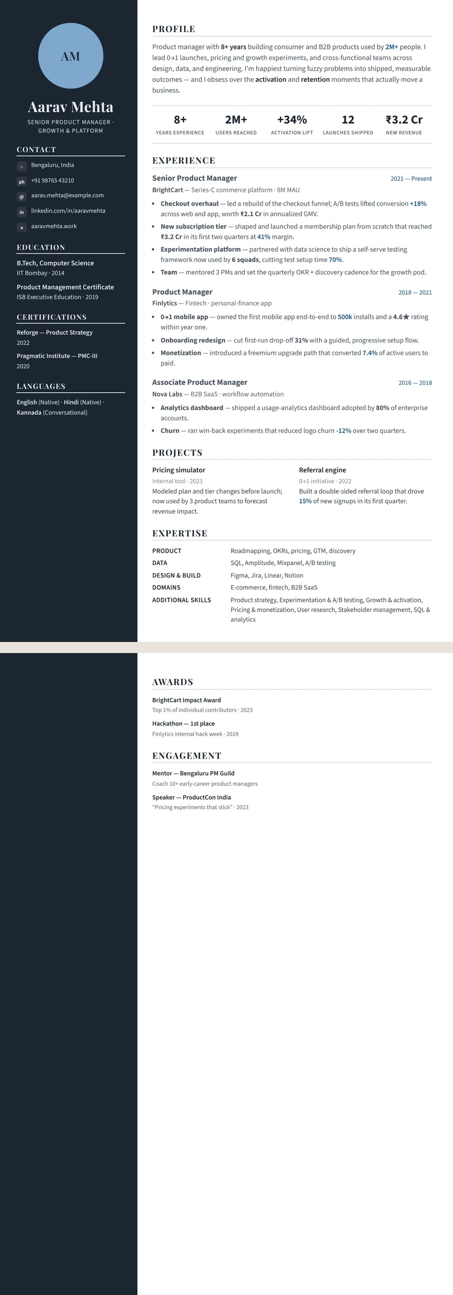
Why blue is the default colour for resumes
Blue is the colour people reach for when they want a resume to look finished but not loud. By long habit it reads as dependable, calm and businesslike, which is why so many company logos and office uniforms use it. That is a design convention, not a law of psychology, but it means a blue CV rarely surprises anyone in the wrong way.
Different blues send slightly different signals:
- Navy — the most conservative. Fine for banking, consulting, law, government and senior roles.
- Corporate blue — clear and modern. Suits operations, sales, HR, healthcare and teaching.
- Indigo — a little more expressive. Good for product, marketing and startup roles.
- Bright blue — reads as technical, especially beside a monospace font.
The one risk with blue is blending in. In a design or advertising application, a blue page can look like the default choice rather than your choice. There, a bolder palette from the creative resume template page may say more about you.
Using blue well: one shade, dark text, sensible print
Blue does its best work in a few places: your name, section titles, fine dividing lines and the sidebar of a two-column design. Body text should stay near-black or deep navy on white. Pale blue text on a white page looks gentle on a phone but fades on a projector or a tired office printer.
Stick to one blue family. Navy with a sky-blue link and a turquoise icon starts to look like three resumes stapled together. ResumeInk keeps each theme to a single family, so the headings, rules and side column always agree.
Navy is the friendliest colour for black and white printing. It becomes a dark grey that is hard to tell from black, so nothing important goes missing. Brighter blues print a shade lighter but remain readable as headings. If an interview panel will be handed photocopies, Professional or Midnight gold will cope with the copier best. A dark navy sidebar turns into a solid charcoal block, so keep what sits inside it brief.
Is a blue resume ATS-friendly?
Yes. An applicant tracking system pulls the text out of your PDF and ignores the colour of the ink. A navy heading is still a plain word to the parser, which has no view on navy versus indigo. The things that do cause trouble are words drawn inside pictures, skills placed in text boxes that float out of order, and sections whose reading order jumps about. Each of the 260 ResumeInk designs is checked for exactly those problems in ATS text extraction.
The honest caveat concerns people rather than software. In the Sidebar layout, the blue themes put light text on a dark navy, indigo or near-black column. On screen that looks crisp. Printed small, or read by someone with tired eyes, it is harder going than dark text on white. Keep the sidebar for short facts like contact details, education and languages, and let the main column carry the sentences.
For the full checklist, read how to make an ATS-friendly resume.
ResumeInk's blue designs, from corporate blue to navy
Four themes make up the blue set, and each pairs with any of the 13 layouts.
- Professional — corporate blue accents (#14507A) with near-black navy text. Its Sidebar version adds a dark navy column; with Compact header it becomes the densest one-page option, skills shown as small chips under the header.
- Indigo modern — blue-violet accents (#4338CA), deep indigo text and an indigo sidebar. See it on the Indigo Timeline design.
- Terminal developer — bright blue on white with a monospace look, made for engineers; the Terminal developer design pairs it with the Developer stack layout.
- Midnight gold — navy (#1C2B4A) for the text and sidebar, lifted by muted gold. Stacked places your expertise grid and education above experience.
Start from a sample, or let the AI rebuild your current resume from a PDF, Word file or photo. Then try navy, indigo and corporate blue side by side: changing colour or layout takes one tap, and you never retype a word.
Blue designs you can use


Build your resume in minutes
Upload your current resume, edit anything, then preview and download it free.
Upload your resumeFrequently asked questions
What colour resume is best for a bank job?
Navy or a dark corporate blue is the usual safe choice for banking, finance and insurance. Keep the colour to headings and rules, keep the body text dark, and choose a calm layout such as Formal, Classic or Traditional.
Will a navy resume print well in black and white?
Yes. Navy prints as a dark grey that is close to black, so headings and text stay sharp. A navy sidebar prints as a solid dark block, which is fine as long as its text is short.
Is a blue resume too plain for a creative job?
It can blend in if the role is in design, fashion or advertising. Indigo modern is the livelier blue, but if you want the page itself to show personality, a bolder colour may serve you better.
Navy or bright blue: which is better for a software developer?
Either works, since the ATS reads the text, not the colour. Terminal developer's bright blue and monospace look signal a technical profile, while Professional's corporate blue suits engineers applying to banks, consultancies or large companies.