Free Gold Resume Template
A gold resume template uses gold the way a good watch does: sparingly, as a detail against something dark. ResumeInk has two. Noir executive is a black and gold resume template, sharp and minimal, with gold accents and a black sidebar. Midnight gold pairs deep navy text and a navy sidebar with muted gold. Both keep gold to headings, rules and small details, never to body text. They suit executives, senior managers, consultants, and luxury and hospitality roles, where a page should feel premium without being loud.
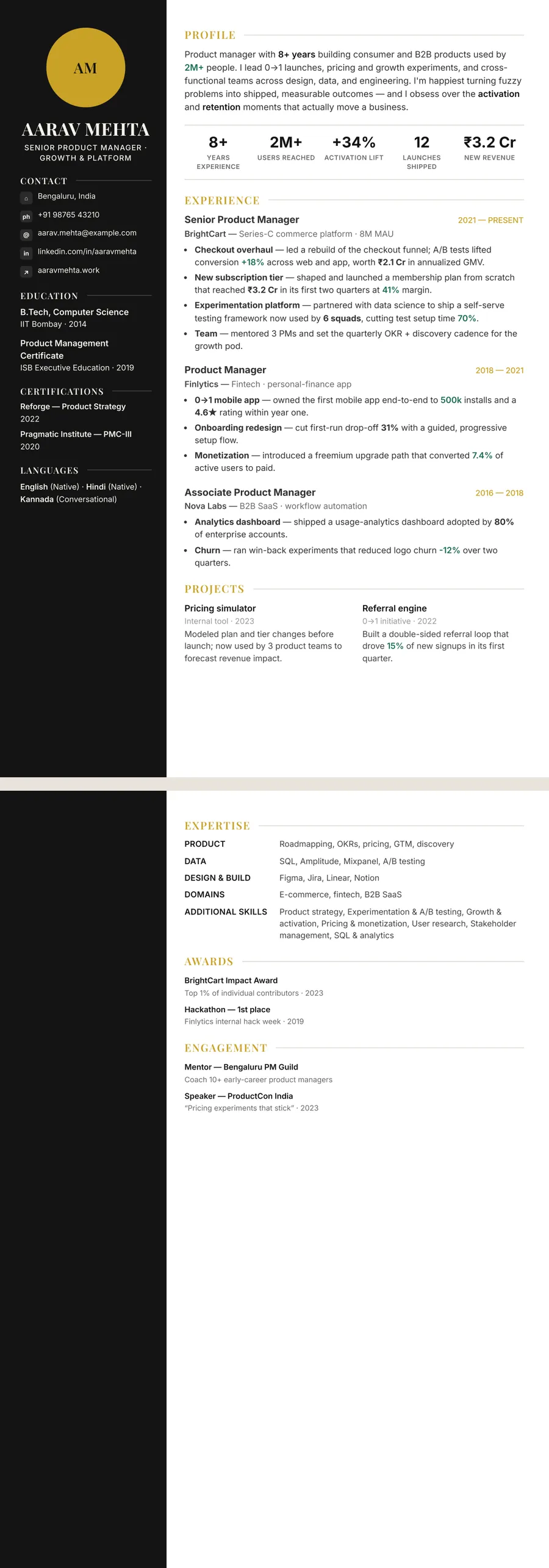
Who a black and gold resume suits
Gold carries strong associations by convention: awards, fine jewellery, formal invitations, a hotel lobby at night. Paired with black it reads as confident and exclusive; paired with navy it reads as established and steady. On a resume the message is much the same: this person is senior and takes care over details.
That makes the gold palette a good match for:
- Executives and senior managers applying for leadership roles
- Luxury retail, fashion, jewellery and hospitality
- Events, real estate and sales roles built on client relationships
- Consultants and founders who send their CV straight to decision makers
Gold can feel like too much for a first job, an internship or a graduate scheme, where a plain page lets your projects speak. It can also look showy for a public-sector post or a conservative law firm. Midnight gold, with its navy base, is the quieter of the two in those settings. For something plainer still, the professional resume template designs keep colour to a minimum.
Using gold well: a detail, not a background
Gold looks best in small doses. In both ResumeInk gold themes it marks headings, rules or your job title, while the body text stays near-black or deep navy. That split matters, because gold on white is a fairly light colour. It is fine for a bold heading or a thin line, but a whole paragraph in gold would tire anyone's eyes.
Do not add a second accent. A gold rule beside a red highlight or a green chart breaks the effect. One dark base, either black or navy, plus one gold, is the whole palette.
Think about printing too. On screen the gold glows a little against black or navy; on paper it is a flat ochre, and in black and white it becomes a light-to-mid grey. Your headings and rules will still show, but they will look quieter than they do on a monitor. A dark sidebar prints as a solid black or charcoal panel and uses plenty of toner. When you can, send the PDF so people see the gold as intended.
Can an ATS read a black and gold resume?
Yes. An applicant tracking system extracts the words from your PDF and takes no notice of their colour, so gold headings and a black or navy sidebar read the same as plain black ones. Problems come from elsewhere: text drawn as an image, columns built from loose text boxes, or a reading order that hops around the page. Both gold themes, in every layout, keep your words as real text in a sensible reading order, and each design is checked in ATS text extraction like the rest of the 260.
Contrast is the part to watch, and it affects people, not parsers. Both gold themes use a dark sidebar with light text in the two-column layouts. That looks sharp on screen, but small cream text on black or navy is harder for some readers, especially on a dim phone or a faded office printout. Keep the sidebar to short items such as contact details, languages and certifications. Gold headings on a white page are lighter than black ones too, so they work because they are bold and brief.
The ATS resume builder page has more on how ResumeInk handles hiring software.
ResumeInk's gold designs: Noir executive and Midnight gold
Two themes carry gold, each on a different dark base, and both work with all 13 layouts.
- Noir executive — black (#141414) with gold accents (#C9A227) and a black sidebar. The Sidebar layout gives you a full-height black column with a photo or initials circle; Compact header fits a long career onto one page, with skills as small chips under the header. See the theme on the Noir minimal design.
- Midnight gold — a navy (#1C2B4A) base for text and sidebar, with muted gold accents (#B08D3E). Sidebar suits a confident two-column CV; Atelier gives a centred editorial header and refined spacing for a single-column page with a magazine feel. There is also a Midnight Timeline design.
Send in your existing resume as a PDF, Word file or PNG or JPG photo, and the AI lays it out in the theme you choose. Then compare black and gold with navy and gold. Switching colour or layout takes one tap and keeps every word you wrote.
Gold designs you can use


Build your resume in minutes
Upload your current resume, edit anything, then preview and download it free.
Upload your resumeFrequently asked questions
Is a black and gold resume too flashy?
Not if the gold stays in the details. Noir executive keeps gold to accents on a black and white base, so it reads as sharp rather than showy. For a first job or a conservative employer, Midnight gold's navy base is the calmer pick.
Do gold accents print well?
They print, but they look flatter than on screen: ochre in colour and a light grey in black and white. Headings stay legible because they are bold and set larger than the body, which is dark in both themes.
Navy and gold or black and gold: which should I choose?
Black and gold feels sharper and more fashion-led, which suits luxury, hospitality and creative leadership. Navy and gold feels steadier and more traditional, which suits consulting and senior corporate roles. You can switch between them in one tap.
Can an ATS read the text in a black sidebar?
Yes, because the sidebar text in ResumeInk designs is real, selectable text in a logical reading order. The colour of the panel does not matter to the software, though short items read best for people.