Free Beige Resume Template
A beige resume template trades bright white and bold accents for warm neutrals: cream paper, a soft cream side column, taupe or bronze details. The result feels calm and considered, and it keeps attention on what you have done. ResumeInk has four themes in this family: Ivory editorial, Porcelain white, Letterpress classic and Atelier. They suit roles where taste and trust go together, from interior design and hospitality to publishing, HR and client service, and anyone who wants something softer than navy or black.
What a beige or cream resume suggests
Beige, cream and ivory are the colours of good paper, linen and unvarnished wood. By convention they suggest calm, care and a sense of craft rather than urgency. On a resume that comes across as quiet confidence: the page looks considered, and nothing competes with your words.
That tone fits work where taste and trust matter:
- Design-adjacent roles — interior design, architecture, fashion buying, visual merchandising.
- Hospitality and events — hotel and restaurant management, wedding and event planning.
- Words and people — editing, publishing, communications, HR, executive assistants.
Neutrals are also one of the gentler ways to add warmth in conservative fields. For a bank, a law firm or a government application, choose the lightest option, Porcelain white, and let the accents stay small. If you want a page that feels striking, beige is the wrong tool; look at the creative resume template instead.
Using cream and taupe so the page still reads clearly
A neutral resume works when the warmth lives in the background and the accents, never in the words themselves. A few habits keep it that way:
- Tint behind, ink in front. Cream belongs on the page or in a side column. Body text should stay near-black, as it does in all four ResumeInk themes here.
- Taupe and bronze as signposts. They suit rules, small labels and the odd heading. A full paragraph in taupe on cream would be tiring to read.
- One family per page. Pair cream with a single accent, such as taupe, bronze or wine, and stop there.
- Check it on a phone. Open your PDF on a small, bright screen too, because soft contrast is the first thing to fade there.
Printing is forgiving. On a black and white printer the cream tint turns into a faint grey wash or barely shows, while the dark text stays crisp. If you would rather have no tint at all, Porcelain white is the closest to plain white paper.
Are beige resumes ATS-friendly?
Yes, as long as the text underneath is sound. An applicant tracking system reads the text layer of your PDF and never sees the cream page. A beige design is no harder for the software to read than a white one. What does make a difference:
- Real text. Headings, dates and contact details must be typed text, not part of an image. Every ResumeInk design is checked for this.
- Reading order. In two-column layouts like Portrait, the side column and the main column need to come out in a sensible sequence. That is checked too.
- Contrast for people. Software extracts pale text without trouble; a hiring manager squinting at a laptop may not. Low contrast is the usual weak spot of neutral palettes, which is why these themes keep body text near-black.
Inside the editor, an ATS score shows how readable your resume is for hiring software. For the background, read what an ATS is and how it works.
ResumeInk's beige, cream and neutral designs
Four ResumeInk themes make up this warm, neutral family. Each works with all 13 layouts; here is how they look in the pairings on this page.
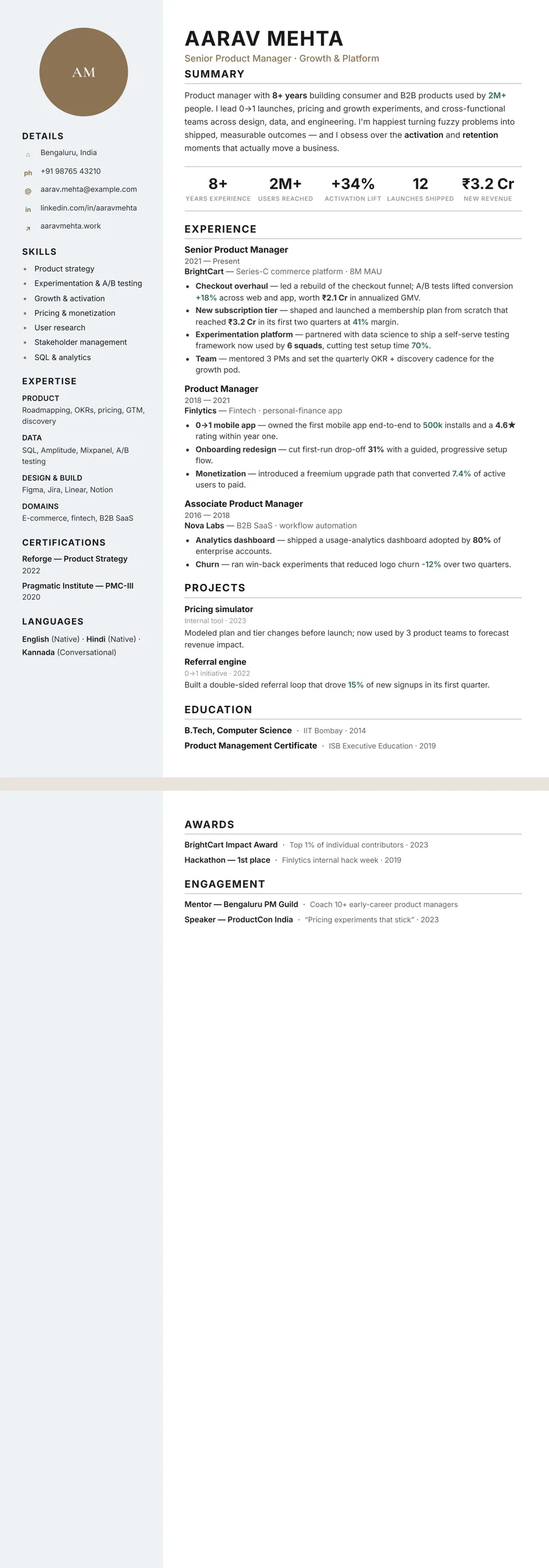
- Ivory editorial — brown-taupe accents on a white main page with a cream side column. In the Portrait layout your photo sits in a circle at the top of that light column, with details, skills and languages below. See the Ivory editorial template.
- Letterpress classic — a true cream page with wine-red accents and a printed, bookish feel. The Classic layout keeps dates in a narrow column to the left of each role. See the Letterpress classic template.
- Porcelain white — the lightest of the four, soft white with warm taupe accents, shown in the Atelier layout's centred editorial header.
- Atelier — bronze accents on a warm off-white page with a cream side column, here in the Letterpress layout with its large serif name and small ornament.
Upload your current resume as a PDF, Word file or photo, or start from the sample. Then switch theme or layout in one tap; your words stay put.
Beige designs you can use


Build your resume in minutes
Upload your current resume, edit anything, then preview and download it free.
Upload your resumeFrequently asked questions
Is a beige resume professional enough for corporate jobs?
Yes, in most cases. Beige and cream are neutrals, and with near-black body text they read as polished rather than playful. For the most formal employers, such as banks or government departments, pick Porcelain white, the lightest of the four themes.
What is the difference between beige, cream and ivory on a resume?
They are loose names for warm off-whites: cream is slightly yellow, ivory paler and beige a little more tan. On ResumeInk, Letterpress classic has a full cream page, Ivory editorial and Atelier use a cream side column, and Porcelain white is close to plain white.
Will a cream background print properly on white paper?
Printing the PDF reproduces the cream as a light tint, which looks good on a colour printer. On a black and white printer it becomes a faint grey wash or barely shows, and your dark text stays sharp.
Which accent colour goes best with a beige resume?
Warm, muted accents work best: taupe, bronze, soft brown or a deep wine red. Choose one and keep everything else dark, since a bright second colour fights with the calm of a neutral page.