Free Classic Letterpress Resume Template
Letterpress white is a crisp, centered, classic letterpress white resume template — an EB Garamond serif on clean white paper, with a spaced-caps masthead, a small diamond divider, and rule-flanked centered section headers that give it the feel of an engraved invitation. It is formal and timeless, suited to law, finance, academia, consulting, and senior or executive roles where a traditional, dignified presentation signals real authority. Upload your existing resume and let AI rebuild it in this design; preview and download it free.
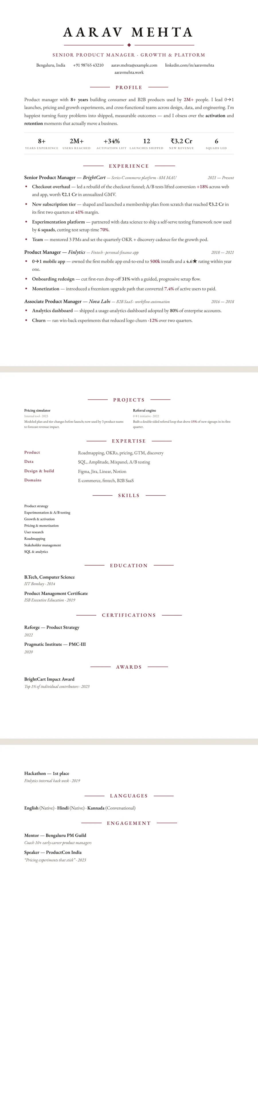
What makes the Letterpress white Letterpress design stand out
Letterpress white is built around a centered EB Garamond serif on a clean white page, so it reads like an engraved invitation rather than a software template. The masthead anchors your name in spaced caps under a small diamond divider, and each section opens with a rule-flanked, centered header — the classic — PROFILE — treatment — that gives the whole page a quiet, ceremonial rhythm.
Underneath the formality it stays highly readable: a justified summary paragraph, serif role titles with italic dates set in a muted grey, and crisp bullets marked in a deep wine accent. The white paper keeps it sharp and modern while the typography stays timeless, leaving an impression of polish, precision, and seniority without any flashy graphics.
Who it's best for
Letterpress white suits people whose credibility rests on craft and judgement, and any field where a formal, traditional presentation signals seniority. It is a natural fit for:
- Law, finance, academia, consulting, and other conservative or credential-heavy professions
- Executives and senior leaders who want a dignified, understated one- or two-page resume
- Product managers and strategy roles that value clear, narrative-driven framing
- Marketing and brand professionals who appreciate refined typographic taste
- Sales and business-development candidates pitching to traditional, relationship-led industries
Why it's ATS-friendly
The classic look is achieved entirely with real, selectable text and a single-column, top-to-bottom flow — no multi-column tables, text boxes, or images that confuse parsers. The centered headers, diamond divider, and rule lines are pure styling, so an applicant tracking system still reads one clean column of text in the natural order: your name, then each section heading, then your experience, skills, and education. That means your content gets parsed accurately while recruiters see the formal, letterpress finish.
The Letterpress white typography and colours
Letterpress white uses one typeface throughout: EB Garamond, a revival of Claude Garamond's classic book type, for the name, the headings and the body. A single serif everywhere is what gives the page its printed-book character. Italics do the job a second font would do elsewhere, setting employer names and dates apart from role titles.
The colours are restrained. The page is pure white, the text is a warm near-black, and a deep wine red (#7A2E3A) is the only accent. It colours the thin rules and small diamond under your name, the target title, every centred section heading, the bullet markers and the figures you highlight in your experience. On white paper the wine reads as rich but not loud, closer to ink than to a brand colour.
In black and white the wine becomes a dark grey, so headings, rules and bullet markers keep their weight and the page still looks deliberate. Because the body is already close to black, nothing important fades, which makes this a dependable theme to send to a recruiter who prints applications.
How to fill in the Letterpress layout
The Letterpress layout is a single column under a centred masthead: your name in large spaced capitals, a small ornament between two rules, then your target title and contact details centred beneath. Every section heading is centred too, flanked by short rules.
- Profile: a short paragraph of three or four lines. This layout rewards measured prose, so write full sentences rather than fragments.
- Experience: each role opens on one line with the title, the employer in italics and a short descriptor, with the dates in italics at the right margin. Keep three or four bullets per role.
- Expertise: labelled rows, with the label in wine and the skills beside it. Four rows is plenty.
- Education, certifications, awards, languages: each gets its own centred heading lower down.
The spacing is generous, so a senior history usually runs to two pages, which is normal here. To hold one page, cut older roles to a single line. There is no photo slot. An experience line in the right register: “Advised the board on a cross-border acquisition, from due diligence to completion.”
Who the Letterpress white design suits
Letterpress white is built for professions where tradition is part of the brand: law, accounting and audit, private banking, wealth management, publishing, academia, diplomacy, the civil service and long-established consultancies. It suits senior and executive candidates best, and it works well for a partner-track or board-level CV that should look composed rather than fashionable. Graduates can use it too, for example when applying for law or finance training schemes, but should keep it to one tight page.
There is no photo in this layout, which fits the US, UK, Canada and Australia, where photos are usually left off. In India and the Gulf a photo is common; if you need one, the same theme can switch to the Sidebar or Portrait layout, both of which hold a photo circle.
Pick a plainer design for start-ups, tech companies or creative studios, where an engraved, all-serif look can read as old-fashioned, or if your resume is dense with tools and figures. A sans-serif theme carries that kind of content more easily.
See it in use
None of the role examples on the site is drawn in Letterpress white yet, but two of them cover jobs where it would suit well:
- The lawyer resume example would suit Letterpress white, since legal CVs reward a formal, conventional page.
- The accountant resume example would suit it too, especially for audit and advisory roles at established firms.
The theme does appear on the burgundy resume templates page, next to other wine-toned designs. For a similar mood in other formats, see the traditional resume templates; if you want the wine colour with a side column and room for a photo, the Bordeaux sidebar design is the closest relative. Whatever you build, one tap switches the theme or layout and your text stays as it is, so trying Letterpress white on your own content is quick. If you prefer a warmer page, its cream sibling, Letterpress classic, is in the same family.
Premium, ATS-friendly templates


Build your resume in minutes
Upload your current resume, edit anything, then preview and download it free.
Upload your resumeFrequently asked questions
Is the Letterpress white template ATS-friendly?
Yes. It uses real selectable text in a single-column, top-to-bottom flow, so applicant tracking systems read your name, sections, and experience in order — the centered headers and rule lines are styling only.
Can I edit or recolour this template?
Yes. Every word stays fully editable in ResumeInk, and you can adjust the design and switch themes freely — the letterpress look pairs a serif typeface with a deep wine accent on white paper by default.
How do I use the Letterpress white design?
Upload your existing resume as a PDF, Word doc, or photo, and ResumeInk's AI rebuilds it in this design. Previewing, editing, and downloading the final PDF are all free.
Is EB Garamond a good font for a resume?
Yes, especially for formal and traditional fields. It is a classic book serif that stays readable at body size, and in this design it is real, selectable text, so hiring software reads it like any other font.
Should I choose Letterpress white or the cream Letterpress classic theme?
Both share the serif type and wine accent. Letterpress classic sets them on cream for a warmer, older feel, while Letterpress white uses a pure white page that looks crisper on screen and in print; you can switch between them in one tap.