Free Swiss Minimal Resume Template
The Swiss minimal resume template brings the International Typographic Style to your job search: a calm layout built on a strict grid, restrained type, and deliberate white space that lets every line breathe. Your name sits large at the top beside a single red bar, sections stack in a single clean column, and nothing competes for attention except your work. It suits anyone who wants to look polished and modern without colour blocks or icons getting in the way.
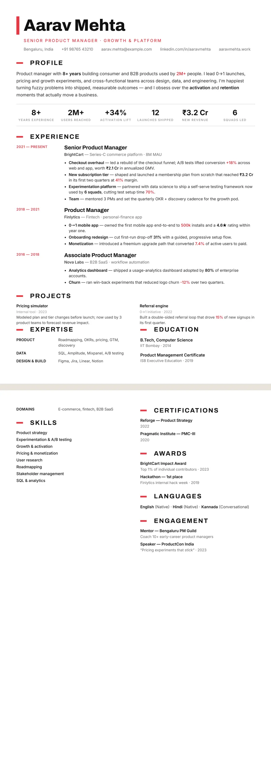
What makes the Swiss Classic centered design stand out
This design is rooted in classic Swiss, or International Typographic, principles: a disciplined grid, generous margins, and crisp sans-serif type that does the talking. The header sets your name large beside a red bar with your contact details beneath it, then experience, education, and skills flow down a single column with even, rhythmic spacing. There are no busy sidebars, decorative rules, or colour fills to distract a reader.
The impression is quiet confidence. All that white space signals that you have nothing to hide and everything well organised, which reads as senior, considered, and detail-oriented. It is the kind of layout that looks just as composed printed on paper as it does on a recruiter's screen.
Who it's best for
The Swiss look flatters roles where clarity, structure, and a modern-but-understated tone matter most:
- Product managers who need to show strategy and impact cleanly
- Software engineers who prefer substance over decoration
- Data scientists and analysts presenting precise, results-driven work
- Designers, architects, and consultants who appreciate typographic restraint
- Senior professionals who want a calm, premium first impression
Why it's ATS-friendly
Despite its refined look, this template is built from real, selectable text in a single top-to-bottom column, so applicant tracking systems read it exactly as a recruiter would. The header is still plain text, standard section headings like Experience, Education, and Skills are preserved, and there are no images, text boxes, or multi-column tables to scramble the parsing order. Your details come through cleanly in both the ATS and the human review.
The Swiss minimal typography and colours
Swiss minimal sets headings in Archivo, a compact grotesque used here at a heavy weight for the name, and runs the body in Inter, a sans drawn for screens that stays clear at small sizes. Together they read as engineered rather than decorated: no serifs, no flourishes, just sharp letterforms and tight spacing.
The palette is almost entirely black on white. Text sits in a near-black ink, dividing lines are a pale grey, and a single signal red (#E63946) does all the colour work. It appears as a thick vertical bar beside your name, in your target title, as a short dash before every section heading, and on the dates and highlighted figures in your experience. Because the red is rationed, the eye lands on exactly those things first.
In black and white the red becomes a mid grey. The bar and dashes still mark each section, figures still stand apart from the surrounding text, and the near-black headings keep full contrast, so a photocopy loses the colour but not the structure.
How to fill in the Classic centered layout
Classic centered is a single column, which makes it the easiest layout to fill well. In the Swiss theme the name is set flush left beside the red bar, with your target title and one line of contact details underneath.
- Profile: three or four lines covering what you do, for whom, and the result you are known for.
- Key numbers: a row of figures under the profile, which you can hide. Use real ones taken from your bullets.
- Experience: dates go in a narrow left column, so each role title and its bullets line up cleanly to the right. Give recent roles three to five bullets and older ones two.
- Projects, expertise, education: shorter sections near the end, several of them sitting side by side.
One page holds most careers up to around ten years; beyond that, two pages are fine. There is no photo slot. A bullet that suits the grid: “Rebuilt the checkout flow with design and data; conversion rose 18% in two quarters.”
Who the Swiss minimal design suits
Swiss minimal works best when your work is precise and your results are easy to state. It suits product, engineering, design, data and consulting roles, and it fits fast-moving sectors such as software, fintech, e-commerce and agencies, where a crisp page reads as current. It is just as comfortable carrying a graduate's first one-page resume as a mid-career specialist's record, wherever numbers should lead.
Because this layout has no photo, the design is ready for the US, UK, Canada and Australia, where photos are usually left off. If you are applying in India or the Gulf and want a photo, keep the Swiss theme and move to the Sidebar, Portrait, Compact header or Timeline layout, which can show one.
Pick something quieter for conservative employers such as law firms, private banks or the public sector, where a red accent can look loud. The understated Platinum executive design keeps the same discipline with a calmer palette.
See it in use
Swiss minimal shows up in three role examples on the site, each in a different layout, so you can see how the theme behaves beyond this page:
- The product manager resume example uses Swiss minimal in the Stacked layout, with expertise and education above the experience.
- The internship resume example uses it in the Compact header layout, where your skills sit as small chips just below the header.
- The cloud engineer resume example sets it in the Developer stack layout, where technical skills and projects are prominent.
Each is a complete, filled-in page, which makes it the quickest way to judge how much the Swiss grid holds before you start.
The red resume templates page shows Swiss minimal beside other red-accented designs. For the same restraint with even less colour, browse the minimalist resume templates. Whichever you start in, you can switch theme or layout in one tap and your words stay put, so trying the Swiss look takes a single click.
Premium, ATS-friendly templates


Build your resume in minutes
Upload your current resume, edit anything, then preview and download it free.
Upload your resumeFrequently asked questions
Is the Swiss minimal template ATS-friendly?
Yes. It uses real, selectable text and a single-column flow with standard section headings, so applicant tracking systems can parse your experience, skills, and education correctly.
Can I edit and recolour this template?
Yes. You can edit every section, reorder content, and adjust the styling in the builder. The Swiss look is intentionally minimal, but you can fine-tune type, spacing, and tone before downloading.
How do I use this Swiss design?
Upload your existing resume as a PDF, Word file, or photo, and ResumeInk's AI rebuilds it in this Swiss minimal design. Previewing and downloading the final PDF are both free.
Does the Swiss minimal design fit on one page?
Usually, yes. The single column and compact Inter body text hold a lot, so most early and mid-career resumes fit on one page; if yours runs over, hide the key numbers row, trim older roles, or try the Compact header layout in the same theme.
Is the Swiss minimal design too plain for a creative role?
Not usually. Its character comes from precise type and one strong red accent, which reads as deliberate design rather than a lack of it. If you want more visual personality, your content can move to a bolder theme in one tap.