Free Minimalist Resume Template
A minimalist resume template does more with less: one accent colour, plenty of white space, clean type and no decoration that does not help someone read. The effect is calm and confident, and it keeps attention on what you have done rather than on the design. A minimal resume suits nearly every industry, from finance and law to tech and design, and it is a safe choice when you do not know who will read it. ResumeInk's minimalist designs pair restrained themes with simple, ATS-checked layouts.
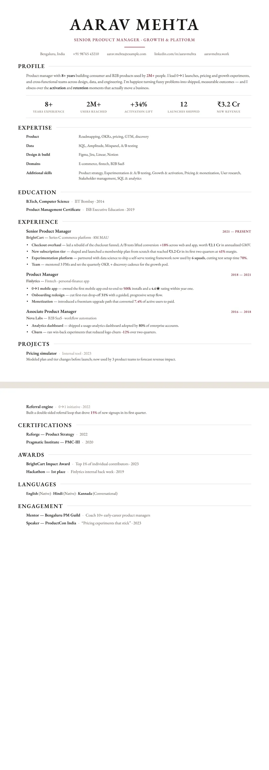
What makes a resume minimalist
Minimalism is about restraint, not about being plain. A minimalist resume usually has:
- One accent colour, or none, used only for headings, rules or your name
- White space between sections, so each one is easy to find
- One or two typefaces, chosen for reading rather than display
- No icons or charts; everything is said in words
The difference from a simple resume template is intent. A simple resume is quick and functional. A minimalist one is designed: spacing, type sizes and margins are tuned so the page feels considered even though little is on it. Compared with a modern or creative resume, it trades colour and bold highlights for quiet structure.
Done well, a minimal resume reads like a well-set book page. Done badly, it reads like a draft. The difference is usually hierarchy. Your name, headings, job titles and dates each need a clear, consistent size and weight, so the eye knows where to go without any decoration to guide it.
Who should use a minimal resume, and when not to
Because it never gets in the way, a minimal resume works in most industries and countries. It is a strong fit for:
- Finance, law and consulting, where restraint signals judgment
- Designers and architects, who are often judged on taste and spacing
- Engineers and researchers who want the work to speak for itself
- Senior leaders, for whom a busy page can look junior
It also travels well. A clean, minimal CV reads the same to a recruiter in Bengaluru, London or Sydney, and it prints well in black and white.
When might you want more? If you are early in your career with little to list, generous white space can make a page look empty; a denser layout such as Compact header fills it better. In sales or marketing, where personality helps, a modern resume template with a little more colour may suit you. And if you have many short facts to show, a two-column layout uses the space more efficiently.
Minimalist resumes and ATS: why less helps
Minimal designs tend to be among the easiest for applicant tracking systems to read, for plain reasons. No icons stand in for words, so a phone symbol never replaces the word itself. Headings are short and standard. The single column means the reading order matches the visual order, top to bottom.
In ResumeInk, nothing on the page is a picture of text. Every word can be selected and copied, in the order you would read it, and each design is checked in ATS text extraction. The minimalist themes add nothing on top that could get in the way.
One caution: minimal should not mean thin on keywords. A restrained page still needs the skills and job titles a recruiter will search for. Mirror the wording of the job description where it honestly describes you, and use the ATS score in the editor to check how readable the result is. Our guide to resume keywords for ATS screening shows how to choose them without stuffing.
Making a minimalist resume with ResumeInk
Bring your existing resume as a PDF, a Word file or a photo, or start from a sample, and the AI places your content in the design you choose. For a minimal look, pick one of these themes:
- Swiss minimal — neutral type and a single red accent
- Black and white — no colour at all, ideal for printing
- Letterpress white — crisp white with a classic serif
- Porcelain white — soft white and refined
- Noir executive — sharp black and minimal, for senior roles
Pair the theme with the Classic, Letterpress or Atelier layout. Classic is the most direct. Letterpress adds a centred masthead with a large serif name and a small ornament. Atelier has an editorial header and refined spacing. Adjust fonts, colours and spacing if you like. Changed your mind? Any of the other 259 designs is one tap away, and nothing needs retyping.
Minimalist designs you can use


Build your resume in minutes
Upload your current resume, edit anything, then preview and download it free.
Upload your resumeFrequently asked questions
Is a minimalist resume ATS-friendly?
Usually yes, because a minimal design has no icons, graphics or complex columns to confuse a parser. ResumeInk also checks each of its designs for clean ATS text extraction.
Can a minimalist resume use colour?
Yes, but keep it to one accent for headings, rules or your name. The Swiss minimal theme, for example, uses a single red accent, while Black and white uses none.
Will a minimal resume look too plain?
Not if the hierarchy is clear. Consistent sizes for your name, headings and job titles, with even spacing, make a sparse page look deliberate rather than empty.
Which industries suit a minimalist resume?
Almost all of them, including finance, law, consulting, tech, design and research. In sales or marketing you might add a little more colour, but a minimal design is rarely the wrong choice.