Free Modern Resume Template
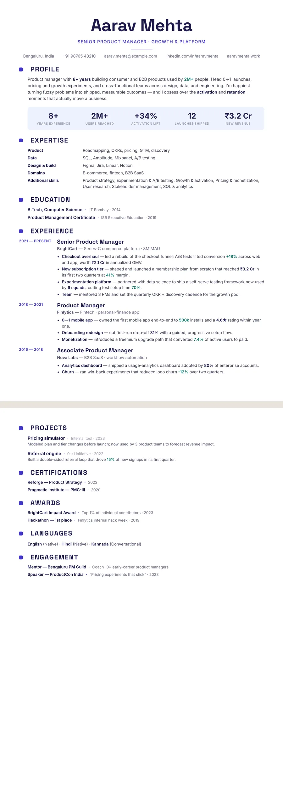
A modern resume template looks current without trying too hard: contemporary type, a row of key numbers near the top, clear hierarchy and colour used sparingly to guide the eye. It suits most private-sector roles, especially tech, product, marketing and startups, and anyone whose results are easy to measure. Modern is not the same as creative. It keeps the section order recruiters and hiring software expect, and puts its personality into type and spacing. Every ResumeInk modern design is checked for ATS readability.
What makes a resume template modern
A modern resume borrows from good product and web design: strong type, clear structure, and nothing that does not help the reader. You will usually see:
- Contemporary type — clean sans-serif or geometric fonts for headings
- A key-number row — three to five headline figures, such as years of experience, team size or revenue grown, just under your profile
- Clear hierarchy — your name, then job titles, then details, each easy to tell apart
- Sparing colour — one accent for headings, dates or numbers, never whole blocks of it
Compare that with a traditional resume, which leans on serif type, centred headings and a formal tone, and with a creative resume, which may use illustrations, unusual layouts or bold colour fields. Modern sits between the two. It feels fresh, yet a recruiter can still find your latest job title at a glance.
Who should use a modern resume, and who should not
Modern templates fit people whose work moves quickly and can be measured:
- Software engineers, data analysts and product managers
- Marketing, growth and sales roles where numbers tell the story
- Startups, agencies and tech companies in India, the US, the UK and Australia
- Early and mid-career candidates who want to look current
The key-number row is the part to plan for. It works when you have real figures, such as revenue, users, savings or turnaround times. If your results are hard to count, a modern design still works; keep the row honest, or hide it.
When should you pick something else? For law, government, academia or board-level roles, a professional resume template with a more traditional feel often reads as the better fit. And if you work in illustration or art direction, your portfolio carries the creativity, so a modern resume beside it is still a sound choice.
Do modern resume designs work with ATS?
Modern design and ATS readability are not at odds, as long as the style lives in the type and spacing rather than in pictures. What trips up hiring software is mostly decoration: text set inside graphics, icons used instead of words, and headings renamed to something clever. A modern resume can skip all of that and still look fresh.
In ResumeInk, the key-number row is real text, so a parser reads a figure like 8+ years the same way a person does. Headings stay standard: Profile, Experience, Projects, Education. Dates sit in a predictable place. Every design, modern or not, is checked in ATS text extraction for real, selectable text in a logical reading order.
The editor also shows an ATS score, which tells you how readable your resume is for hiring software. Look at it again after big edits, and run through the ATS resume checklist before you send anything.
Create a modern resume in ResumeInk
Begin with a sample, or upload what you have: a PDF, a Word document or a phone photo of a printed resume. ResumeInk's AI reads it and sets it in the design you pick. Strong modern combinations:
- Indigo modern Timeline — geometric headings in deep indigo, with roles on a vertical line
- Slate tech Stacked — teal accents, with your expertise grid above experience
- Sage botanical Compact — calm green, with skills as chips under the header
- Professional Timeline — blue accents for a modern look in conservative sectors
Fill the key-number row with three to five figures you can back up in an interview. Use the AI to improve the wording of your bullets, suggest skills or tailor the resume to a job description. Then fine-tune fonts, colours and spacing, and switch to any other design in one tap if you want to compare. Your words stay where they are.
Modern designs you can use


Build your resume in minutes
Upload your current resume, edit anything, then preview and download it free.
Upload your resumeFrequently asked questions
What is the difference between a modern and a creative resume?
A modern resume uses contemporary type, clear hierarchy and a little colour, but keeps the standard section order. A creative resume may use illustrations, unusual layouts or bold colour, which suits a few design fields but can confuse hiring software.
Are modern resume templates ATS-friendly?
They can be, as long as the text is real and not inside images. In ResumeInk, the modern designs go through the same ATS text-extraction check as every other design.
What should go in the key-number row?
Three to five figures that sum up your impact, such as years of experience, team size, revenue, users or money saved. Only use numbers you can explain in an interview.
Is a modern resume right for a government or law job?
A more traditional design is often the safer choice for government, law and academia. In ResumeInk you can switch to the Formal or Traditional layout in one tap without retyping.