Free Burgundy Resume Template
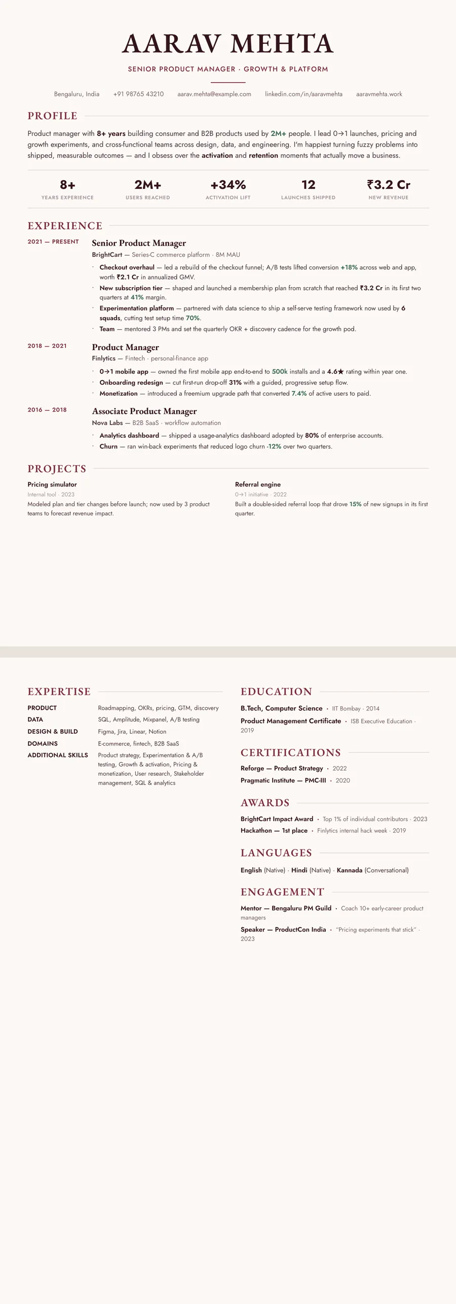
A burgundy resume template uses a deep wine red for the headings and rules, with dark body text on a pale page. If you have been searching for a maroon or wine resume, this is the same family. ResumeInk has four burgundy themes: Bordeaux serif, Letterpress classic on cream paper, Letterpress white on crisp white, and Gallery white with deep crimson accents. Burgundy feels warmer than navy and more grown-up than bright red, which suits academia, publishing, hospitality, the arts and senior roles.
Burgundy, maroon and wine: the impression they give
Burgundy sits between red and brown. It has the warmth of red without the alarm, and it carries old associations by convention: wine, leather-bound books, university crests, theatre curtains. On a CV that usually comes across as confident, cultured and a little traditional.
Where it tends to fit well:
- Academia and research, where a serif burgundy CV feels at home
- Publishing, arts administration and museums
- Hospitality, wine and luxury retail
- Senior and executive roles that want warmth without flash
- Law and policy, kept to thin headings on a white page
Maroon and wine are close cousins, and most people use the three words for the same deep red. Take more care with a strict bank, a government department or a firm with a very plain house style. A burgundy heading is usually fine there, but a page full of red rules is not. For a quieter take on the same refinement, look at the elegant resume template designs.
Using burgundy well: headings, paper and print
Burgundy is strong, so it needs room. Use it for your name, the section headings and the occasional thin rule, and let everything else stay dark. In ResumeInk's burgundy themes the body text is near-black or dark brown, never red, so your bullet points read as text rather than as warnings.
Choose the paper with care. On cream, as in Letterpress classic (#F7F1E6), burgundy looks like ink on a printed page, soft and bookish. On crisp white, as in Letterpress white and Gallery white, the same red looks sharper and more modern. Do not mix a burgundy heading with a pink link or an orange highlight; one deep red family per page is enough.
Burgundy behaves well in black and white printing. It is dark enough to become a strong grey, so headings stay clear on a photocopy. The cream page turns into a very light grey or plain white, depending on the printer, and its warmth disappears. If the paper tone matters to you, send the PDF and let the reader see it on screen.
Is a burgundy resume readable by an ATS?
An applicant tracking system reads characters, not colours, so burgundy headings pose no problem in themselves. The parser sees the word Experience whether it is set in wine red or black. What it cannot do is read text baked into an image, or make sense of a page whose reading order jumps between boxes. ResumeInk's burgundy designs keep every word as selectable text, laid out in the order a person would read it, and they go through the same ATS extraction check as the rest of the 260.
The burgundy themes have an advantage for human readers too. None of them puts pale text on a dark red block. Where a layout has a side column, it is light, with dark text on top, so contrast stays high on screen and on paper. That makes this family a sensible pick if you like colour but worry about readability.
Serif type does not change any of this; the parser still receives plain characters. To see where colour fits among your other formatting choices, read our guide to resume formats.
ResumeInk's burgundy designs: Bordeaux, Letterpress and Gallery
Four themes make up the burgundy set. Each one works with any of the 13 layouts.
- Bordeaux serif — wine accents (#7E2B3A) and serif type on a warm off-white page. Classic puts the dates in a narrow column to the left of each role; Timeline sets your roles along a vertical line with dots. There is also a Bordeaux Sidebar design.
- Letterpress classic — wine-red accents on cream paper. With the Letterpress layout you get a centred masthead and a large serif name with a small ornament, like a printed card. See the Letterpress classic design.
- Letterpress white — the same wine accents on crisp white, for a cleaner, more modern feel.
- Gallery white — deep crimson (#8E2F39) on a white page with bold headings. Portrait adds a light side column with an optional photo circle.
Bring in your current CV as a PDF, Word document or photo of up to 20 MB, then pick a burgundy design. You can move between wine, crimson and any other colour in one tap, and your words carry over untouched.
Burgundy designs you can use


Build your resume in minutes
Upload your current resume, edit anything, then preview and download it free.
Upload your resumeFrequently asked questions
Is a burgundy resume professional?
Yes, for most roles. Burgundy is deep enough to read as serious, especially with serif type and a pale page. For a strict bank or government post, keep it to the headings and pick a calm layout such as Formal or Traditional.
Is burgundy the same as maroon or wine on a resume?
Near enough. All three name a deep red with a touch of brown or purple, and few readers would tell them apart on a page. ResumeInk's wine accents and Gallery white's deep crimson cover that whole range.
Does burgundy suit an academic CV?
It suits one well. Pair Bordeaux serif or Letterpress classic with the Academic layout, which puts education first, and the result reads like a traditional university CV.
Cream or white page: which works better with burgundy?
Cream, as in Letterpress classic, feels warm and bookish on screen. White, as in Letterpress white or Gallery white, is crisper and prints more predictably. If you expect the CV to be printed, white is the safer choice.